I design and build websites that look like your business.

From the first call to launch, you work with me: I set the visual direction, write the code and test it. You get a fast, accessible site that works on every screen and is easy to keep up to date.

Email me
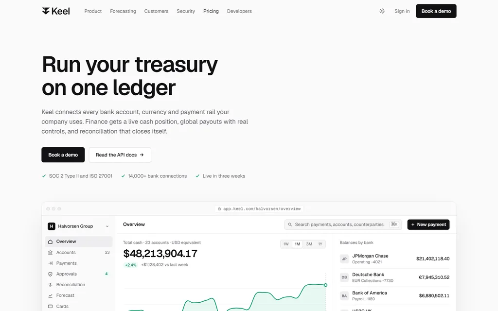
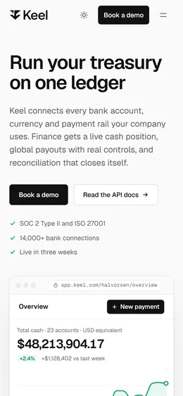
Keel’s home page, treasury software.

Selected work

Six businesses with nothing in common, made only for this portfolio to show what I can really build. Each site starts from a real problem and what that business needs, not from a template. And this is only part of it: tell me what yours needs.

Keel

Treasury software for finance teams that has to look as dependable as a bank. The product appears as a real interface with numbers that add up, and not one filler illustration.

Type
GeistGeist Mono
Palette
Near black, very light grey, emerald green and pale mint.
Interaction
A 13-week cash forecast: switch scenarios and drag the controls to redraw the quarter.
View site
  1. Problem

    A fintech lives or dies on trust. Generic illustrations or numbers that don’t add up break it instantly.

  2. Direction

    Neutrals with a single green, and the product interface built in HTML so every figure is real text.

  3. Key decisions

    • Mockups with real domain data: SEPA and Zengin rails, masked accounts, approval rules.
    • The forecast is an honest model: the pessimistic scenario really does break the cash buffer.
    • On mobile the chart stays pinned above the controls, so you see the effect while you drag.
Mabel & Fig

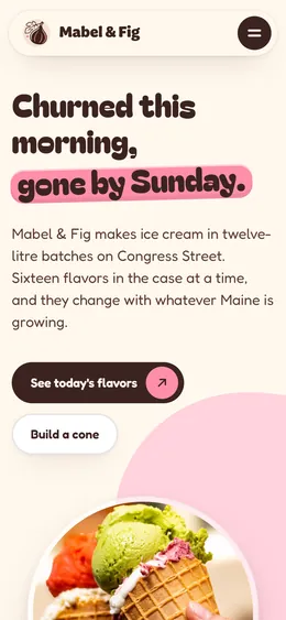
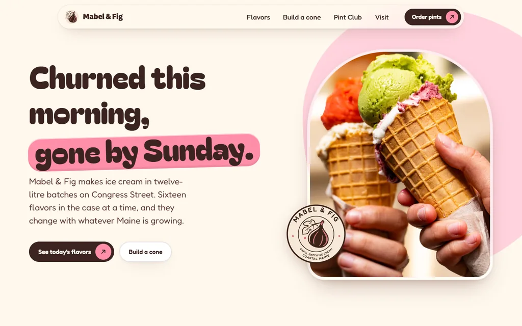
A small-batch ice cream shop in Portland, Maine. Real product photography, colours taken from the menu, and a cone builder that settles the order before anyone reaches the counter.

Type
Bagel Fat OneFredoka
Palette
Strawberry pink, butter yellow, pistachio green and chocolate.
Interaction
Build a cone: three bases, nine flavours, toppings and a live price.
View site
  1. Problem

    An ice cream shop sells through the eyes. Flat drawings of ice cream made nobody hungry and earned no trust.

  2. Direction

    Warm photography and real product cut-outs, with a fat, happy typeface and sweet-shop colours.

  3. Key decisions

    • I cut out 19 pieces without halos (scoops, cones, toppings, pints) and stacked them with seating maths specific to each base.
    • The three-scoop limit only explains itself when you try a fourth, with a wobble.
    • The headline’s line height comes from the font’s real metrics, not a value picked by eye.

The Ardent

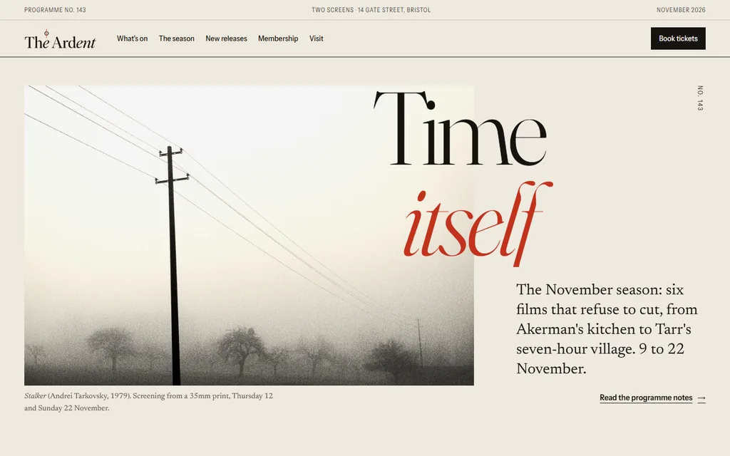
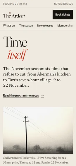
A two-screen independent cinema in Bristol. The programme reads like a film magazine and filters by day and strand, so tonight’s screening is a few seconds away.

Type
FrauncesNewsreaderInstrument Sans
Palette
Paper, ink, red and olive.
Interaction
A programme of 71 screenings you can filter by day and strand, with no dead ends.
View site
  1. Problem

    An arthouse cinema needs editorial authority, and it can’t use real film stills for rights reasons.

  2. Direction

    A magazine grid, a drop cap and a pull quote. Photography that evokes each film, all with the same warm, grainy grade.

  3. Key decisions

    • Each strand shows how many screenings it has that day. When there are none, the empty state offers the next date.
    • Six films in black and white or warm tones, so the season reads as one curated set.
    • A sticky column that covered the grid turned up in a step-by-step overlap scan, and I fixed it at the source.

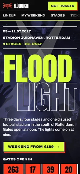
FLOODLIGHT

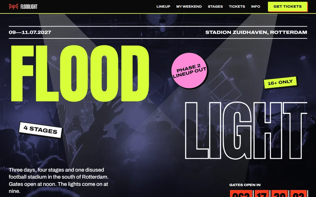
A three-day music festival in a Rotterdam stadium. Loud on the surface and orderly underneath, so people can plan their weekend and share the line-up.

Type
AntonArchivo
Palette
Black, lime, red and blue.
Interaction
My weekend: tap artists to build a schedule, with clashes flagged as you go.
View site
  1. Problem

    Festival sites shout, but they don’t help you decide what to see or when.

  2. Direction

    A huge condensed face, a clash of lime, red and blue, stickers and duotone photography, all on a strict grid.

  3. Key decisions

    • The poster is also the planner: every name is a button.
    • Hours are counted as a union of intervals, so overlapping sets aren’t counted twice.
    • Clearing your plan can be undone, and on mobile a floating counter takes you back to it.

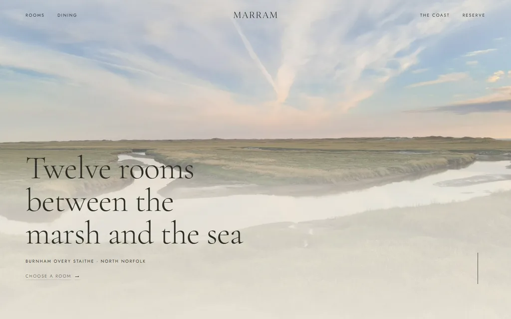
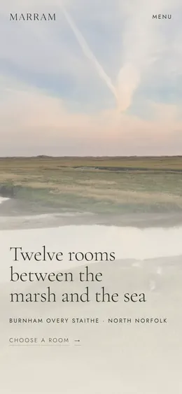
Marram

A twelve-room hotel on the North Norfolk coast. Calm from top to bottom, with honest prices and the view from each room’s window before you book.

Type
Cormorant GaramondJost
Palette
Sand, sage, clay and dark olive.
Interaction
Stay picker: choose a room, a date and the nights, and the arched window shows that room’s view.
View site
  1. Problem

    A small hotel sells a feeling, but people booking need an honest price and to know what they’ll see from the window.

  2. Direction

    Sand, sage and clay; a fine serif with spaced small capitals; slow fades and a quiet landscape.

  3. Key decisions

    • The arched window shows each room’s view and stays on screen on mobile while you choose.
    • Free nights are worked out from the real dates, Sunday to Thursday.
    • The enquiry email already carries the dates, the guests and the quoted price.

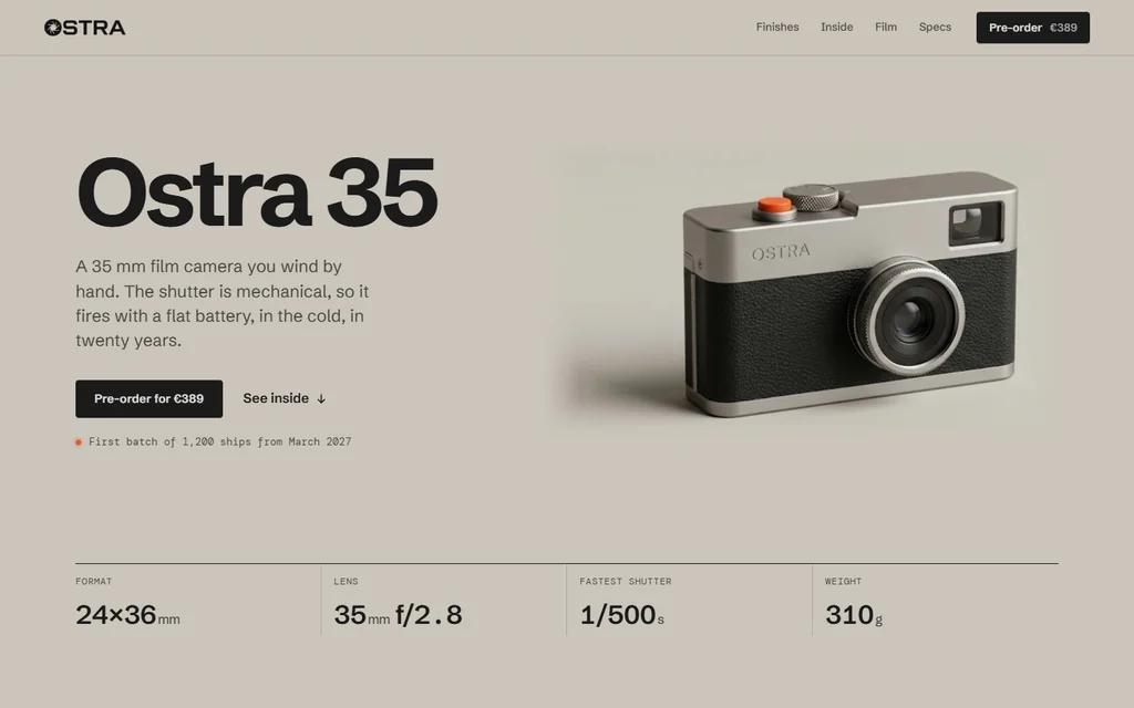
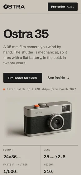
The launch page for a 35 mm film camera from a small hardware company. Tactile and exact: three finishes, the parts inside, full specs and a pre-order with a deposit.

Type
Schibsted GroteskDM Mono
Palette
Studio grey, graphite, titanium, sage and release-button orange.
Interaction
Scroll and the camera comes apart: the assembled body fades into the exploded view, then eight numbered parts are named one by one.
View site
  1. Problem

    A camera is bought by hand and by ear. A launch page has to make metal, weight and a click feel real through a screen, without inventing what the photos don’t show.

  2. Direction

    The page takes the colour of the studio sweep the camera was shot on. A tight grotesk, a mono for figures, and the orange of the release button as the only accent.

  3. Key decisions

    • The exploded view is a single photograph, so it is never cut into fake moving parts: it crossfades from the assembled camera, then numbered pins name each component.
    • The finish picker pans one photograph of all three cameras to the one you chose, instead of recolouring a render.
    • I removed the mirrored engraving from the exploded top plate by rebuilding the metal around it, and cut every photograph out without halos.

How a project runs

You see the work at the end of each step, and nothing moves on until you’ve approved it.

  1. Understand

    We talk about the business, who visits the site and what they need to do there. I turn it into a one-page brief you can approve or change.

  2. Plan

    I lay out every page and what goes on it, list the texts and photos I need from you, and put a date on each step. You always know what comes next, and when.

  3. Direction

    Type, colour and layout chosen for your brand and shown on a real page, not a mood board. We agree on it before anything is built.

  4. Build

    Hand-written HTML, CSS and JavaScript, with images and fonts sized for a phone connection. No page builder and no plugins to keep updated.

  5. Review

    You get a private link that updates as I build. You comment on the page itself, I answer every comment, and nothing moves on until you’re happy with it.

  6. Verify

    I test on phones, tablets and large screens, with a keyboard and a screen reader, and fix what breaks before you see it.

  7. Launch

    I put it live on your domain with HTTPS and hand you a short guide to change texts and photos yourself. If anything breaks in the first month, the fix is on me.